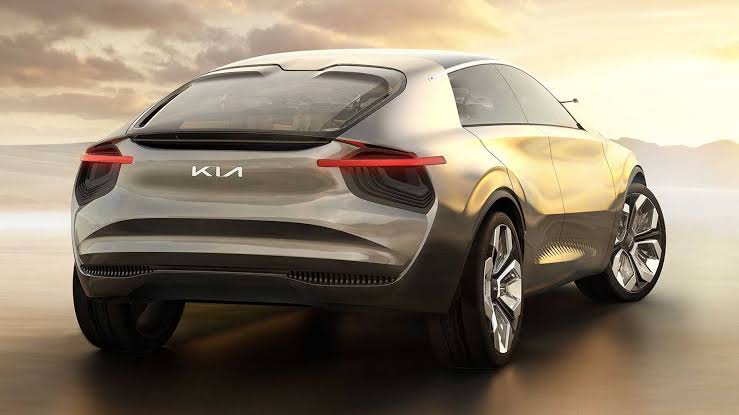
Lead Motor Car company KIA has come up with a New logo which is receiving high criticism from the company’s loyal customer base.

When a troubled motor vehicle manufacturer sinks deep into despair as it struggles to sell generally undesirable cars, a triple whammy of new name, slogan and logo may be necessary. Dramatic do-or-die actions are occasionally required in the bitterly competitive automotive world, and if such measures aren’t forthcoming, then troubled companies may die.
But Kia Motors is at the opposite end of the scale. It’s in rude health, doing most things right (especially EVs), winning awards (it’s the reigning WCOTY champ) and demonstrating that it’s full of life, positive energy and confidence. There is also tantalizing talk of firms teaming up with Kia to exploit its world-class electric motors and state-of-the-art EV tech, including kit that allows vehicles to operate without drivers, riders, pilots or skippers. So far down this path is the company (it had me riding in its driverless cars in Korea decades ago) that there are ongoing conversations surrounding Apple’s long-awaited car being largely based on Kia tech and built by Kia personnel. That’ll seriously miff Korea’s other industrial royal family, the Samsung clan.
With the above and other Kia positives in mind, I wonder why the firm has just resorted to changing its name, slogan and logo. Kia Motors becoming plain ol’ Kia is in one sense unimportant, but in another hugely significant as it implies the company is no longer designing, building and using motors when it obviously is – and will be for many years to come. True, it made sense when Bayerische Motoren Werke decided to call itself BMW, for Fabbrica Italiana Automobili Torino to become Fiat, and Morris Garages to morph into MG. But changing Kia Motors to Kia is unnecessary and counterproductive as it surely sends a message to some that Kia is not in the business of internal combustion and electric motors – when nothing could be further from the truth.
Positives of New Logo
- Modern appeal
- Simplified. Got rid of the cliché oval around the previous wordmark
- Better recall value. Has some character with wordmark as a hand signature
- More scalable. A lot of disproportionate details have been taken off from the letters
Negatives of New Logo
- Unnecessary change of logo
- Ambiguity in design ! In a proper context people would read it correctly as KIA. But new users would not.
- It’s just a 3 letter wordmark, and in those 3 letters, if two letters (IA) look something else (N), then it’s 66% ambiguity in the design! It changes the whole meaning.