The Google logo appears in numerous settings to identify the search engine company. Google has relied on several logos over its history, with the first logo created by Sergey Brin. Through the years, Google launched several path breaking products like Gmail, Calendar, Drive etc. whose logos are recognized by almost every individual who uses internet.
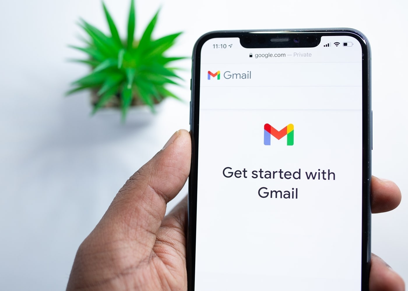
Even with such strong and easily recognizable logos, Google opted for new logos for majority of their products recently. Google tried to make all the logos coherent using the same design language across, but to a lot of users, now they all look the same. This is due to their restrictive brand identity that is solely dependent on their four colors. Humans perceive things more visually. Colors play a significant role in the process. Hence in the case of Google, same-colored logos don’t get registered uniquely.
By incorporating same design language,Google intended to educate people that all those products belongs to same (Google) company. However, such designs are good for forming a consistent icon set on a website, but not good for unique logos. Google needs a new visual system that can comfortably and consistently accommodate its ever-growing product family.