Jo's Art of gifting
Jo's Art of Gifting is an emerging Hyderabad based startup which mainly focuses on the concept of return gifting. The eco-friendly startup needed a brand identity that could communicate their brand values and purpose. Our week long branding exercise resulted in an amazing output for the startup.
- Client
- Jo's Art of Gifting
- Industry
- Gifting
- Working Hours
- 80
- Team Members
- 3
Logo
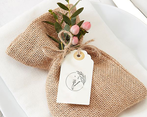
Based on the inputs of customer, the logo-mark of the Gifting company was supposed to be elegant, minimal, rich and floral. As the requests were very specific, we had very limited options to approach. After a session of Brainstorming, we rounded up the Combination mark logo. The logo is a complete word-mark placed inside a circle with an elegant floral design at one end.
Branding
The Brand needed Brand identify that could represent it’s core values – Uniqueness and Sustainability. The challenge was to incorporate both the values with a most appealing form of communication that will engage more audience.
We made a range of creatives to tell the story of the brand and engage the customers. We used the logo in many forms to communicate the brand’s story in the most effective manner. The pink shade used in the logo was used repeatedly across the promotional platforms.